


1
2
3
4
5
6
7
8
9
10
11
12
13
14
15
16
17
18
19

RESEARCH & DISCOVERY
Methods used: Competitor Analysis + 1-on-1 interivew
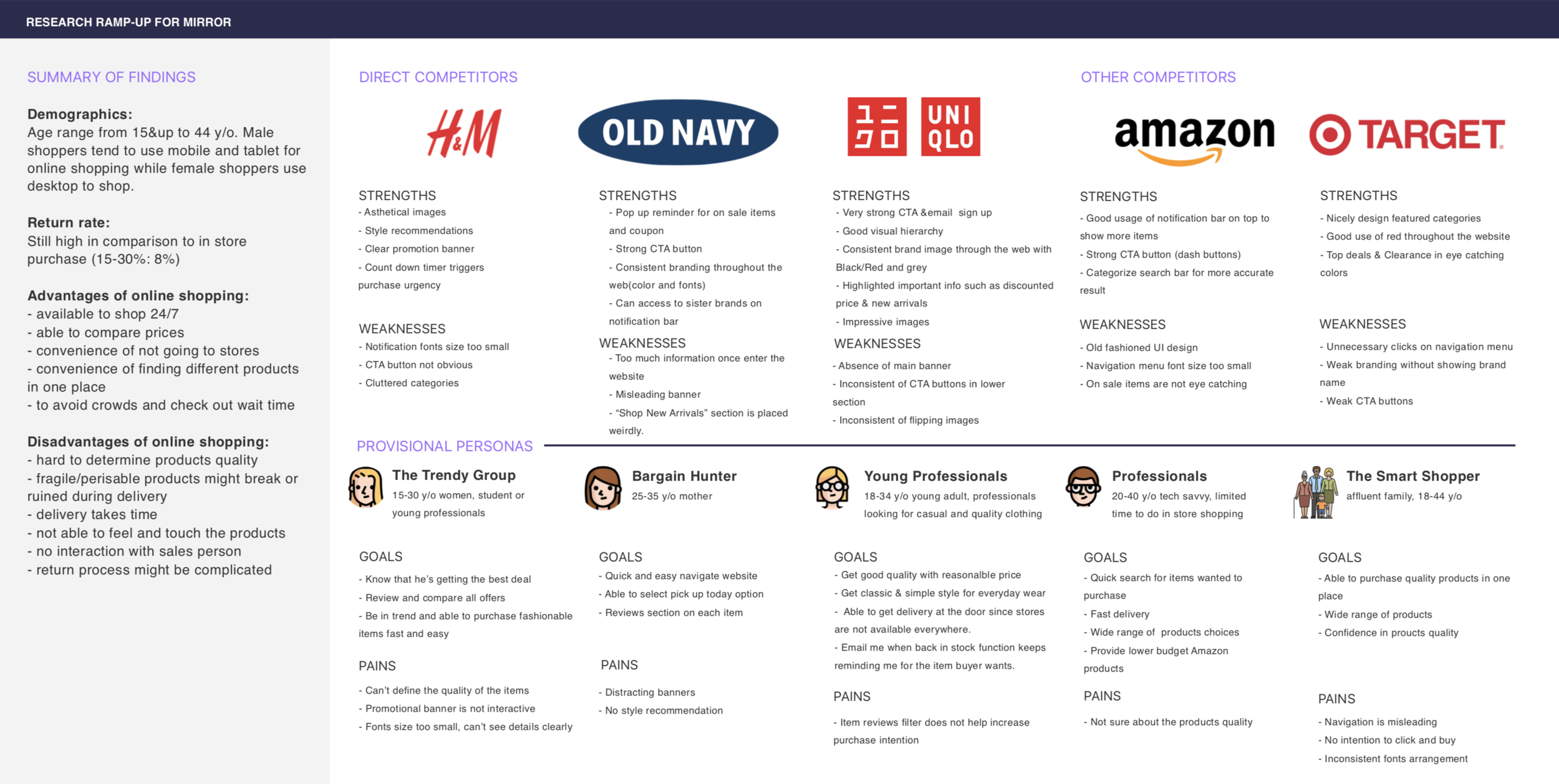
After learning about the role and challenge, I began my research process by looking at both direct and indirect competitors of Mirror. In order to learn more about the market, target audience and competition. Then, I could identify the strengths and weaknesses of other brands. In addition, I created provisional personas to help understanding more of potential users’ sweet spots and pain points of online shopping.
SYNTHESIS & DEFINITION
Methods Used: Empathy Map + Persona + Storyboard
In synthesis stage & with the data collected by observing participants’ think, feel, hear, and shopping behaviors. These findings provide me lots of useful information to look for their needs and insights, I continued with creating empathy map, persona and storyboard.
Insights:
Online shoppers pay the most attention to price, return policy, shipping cost and product descriptions.
Needs:
Occasional sale promotions, easy and efficient return procedure, accurate & detailed product description and secured package to unbox so to be satisfied.
INFORMATION ARCHITECTURE
Methods Used: Project Goals + Card Sorting + Site Map
Next is to define Mirror’s goals (business goals/user goals/ technical considerations). By doing so, I can focus on designing the site to actualize the shared goals.
Conducting card sort so that I can understand wide range of users’ mindset on how they categorize products. Based on the data collected, I can label groups in a more effective way so to give users a quick and easy way to locate their ideal product. Based on the results of the card sort, I created a site map for Mirror as to provide the foundation for a smooth and easy navigation flow.
INTERACTION DESIGN & VISUAL DESIGN
Methods Used: User flow + Task flow + Sketching/Wireframing
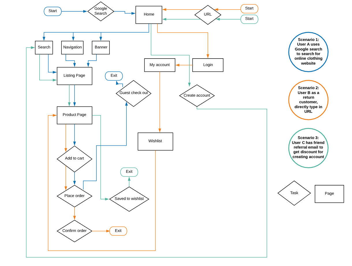
User flow is to think through a user path to take through different scenarios and tasks. By mapping user’s journey and possible decisions, I can design the key pages and necessary steps to follow in order to complete the task with zero error.
Wireframing : Before designing my mid-fidelity wireframe, I have sketched the key pages and established the UI requirements.
You can see my UI requirement list here
Next, I started to create key pages wireframe to showcase the necessary steps for user’s to complete transaction. My previous interview results and research findings help to provide me the mindset to design necessary steps for a smooth user flow.
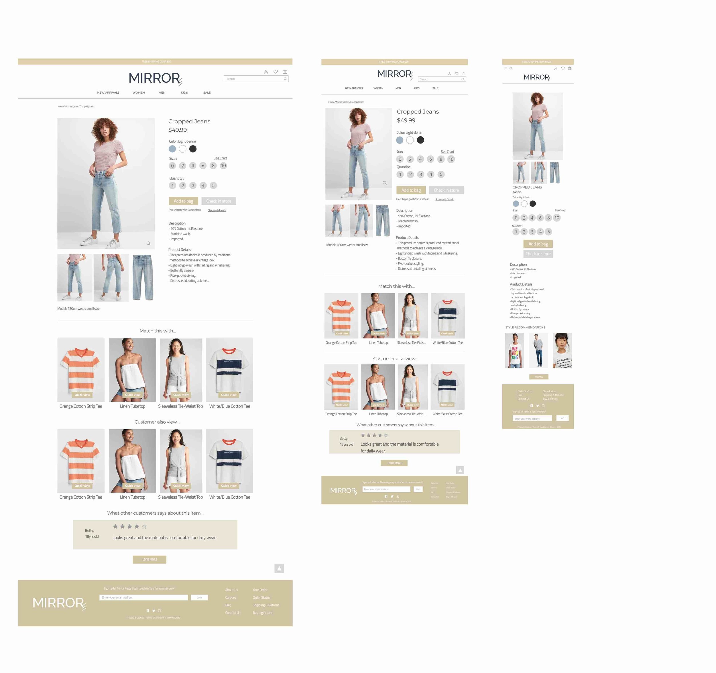
Responsive Wireframes : Created responsive wireframes for Mirror’s homepage in desktop, tablet and mobile version.
This is the mid-fidelity responsive wireframes that I have created based on the feedback from the low fidelity wireframe.
Before moving forward with a high fidelity responsive wireframes, I have sketched out some ideas of Mirror based on the insights that I got from previous research and brainstorm about the brand image.
Mirror as its original meaning, it is often used to see the reflection of a user’s appearance. I wanted to imply this meaning to Mirror’s brand logo and show how well Mirror’s products would impact its buyer. In order to show the aesthetic side of “mirror”, I added the three lines to show the meaning of reflection. In addition, I want to keep it simple and clean, so I chose to use medium grey & the loyal dark blue for the logo. The dark blue represents loyalty, trustworthy while medium grey offer a sense of classic and modern.
PROTOTYPING & TESTING
Methods Used: Usability testing
High-fidelity wireframes : Based upon feedback gathered from the first mid-fidelity prototype, I created an updated, high-fidelity prototype and tested again with participants.
Click here to try the prototype
I created a limited function prototype in Sketch and merge into InVision for users to test out my prototype.
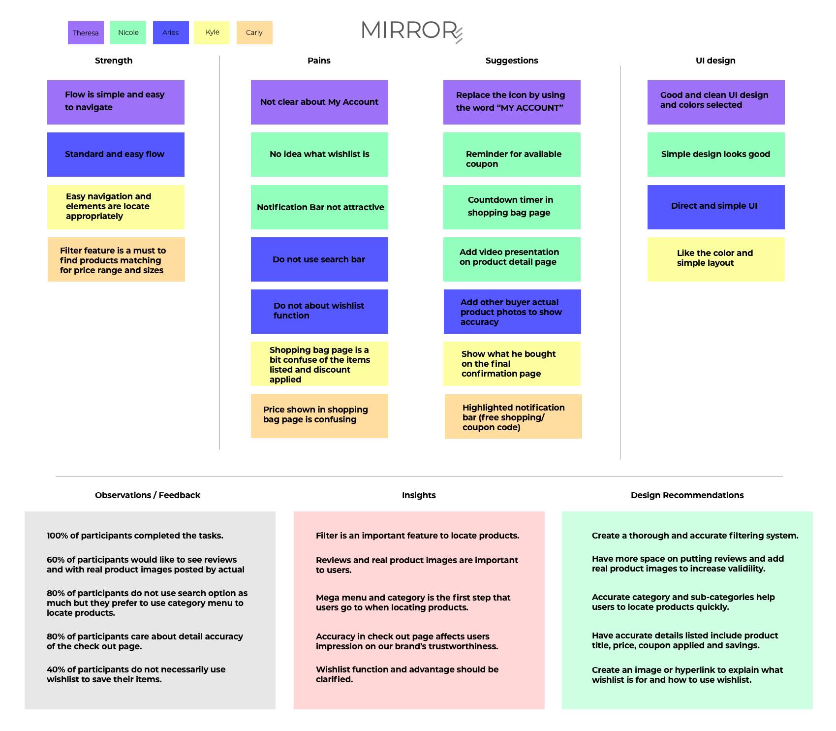
Usability testing : This result is based on five participants with two male and three female age ranged from 26-35 years old. Two tests are done remotely by sharing the InVision prototype link and three are done in person while I watched closely on how they complete the tasks.
First task is to complete transactions with using search bar and navigate to type in promotional code. Second task is to locate wishlist and shopping bag then eventually complete transaction.
Affinity Map: Created this tool as to list out the strengths, pains, suggestions and UI design recommendations that I retrieved from the usability testing. I have put these insights and observations in order from highest to lowest priority. This gives me a broad and detailed idea of what I should be focusing on while iteration phase.
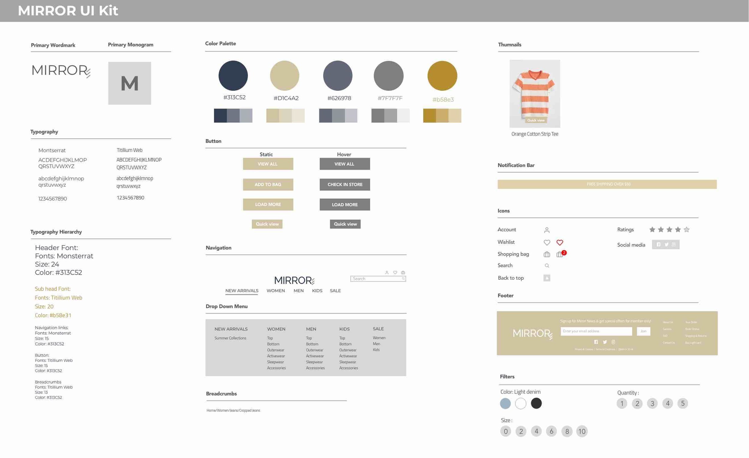
Next is to create a thorough and updated UI Kit as a guideline for collecting all visual elements for the site.
HANDOFF & IMPLEMENTATION
Method Used: Zeplin documentation
Create documentation and handoff for consistency for other designers and engineers in using Zeplin.
NEXT STEP
TEST: Another round of usability testing on the revised prototype.
ITERATE: Based on the second round of testing and observations, I need to iterate the prototype and look for ways to enhance the site’s usability and solve pain points.
If time allows, I would create more features on Mirror’s site:
1. To add video feature to show product details.
2. Add feature like “Discover your size” guide to help users find accurate size that fits users better.