
Spotify
Client: Spotify (an online music streaming application)
Challenge: Create new feature to integrate into current Spotify that help users increase social engagement
Role: UI+UX Designer (Research, Visual Design & Interaction Design)
Result: Within 80 hours over 4 weeks, music streaming market analysis is completed and added new feature with sharing playlist.
RESEARCH & DISCOVERY
Methods used: Market & industry research +Competitor Analysis + App Audit+ provisional persona
Began my research process by looking at both direct and indirect competitors of Spotify. In order to learn more about the market, target audience and competition. Then, I could identify the strengths and weaknesses of other music streaming app.
All these 5 main pages of the page show a clear user flow and I have not encounter any major failure in searching songs. UI design is consistent and categories are clear to locate and direct to use. Overall experience is smooth and easy to navigate.
Spotify did a good job on creating user experience focus design, the reason I would say so because:
The app itself provides many different entry point for users to access to music.
The app provides lots of similar music recommendations.
The app also suggests music based on choosing genres and moods.
Next, below showing 4 different ways that users can share their music to their contacts.
I also created provisional personas which embody demographic and behavioral traits that match Spotify's core user base and market. These helped me identify people who might be ideal interview subjects and consider how I might want to frame my interview questions and planning.
SYNTHESIS & DEFINITION
Methods Used: Empathy Map + Persona+POV Statements+ HMW questions+group brainstorming
In synthesis stage & with the data collected by observing participants’ think, feel, hear, and music listening behaviors. These findings provide me lots of useful information to look for their needs and insights, I continued with creating empathy map, persona.
In addition, I created provisional personas to help understanding more of potential users’ sweet spots and pain points of using music streaming app.
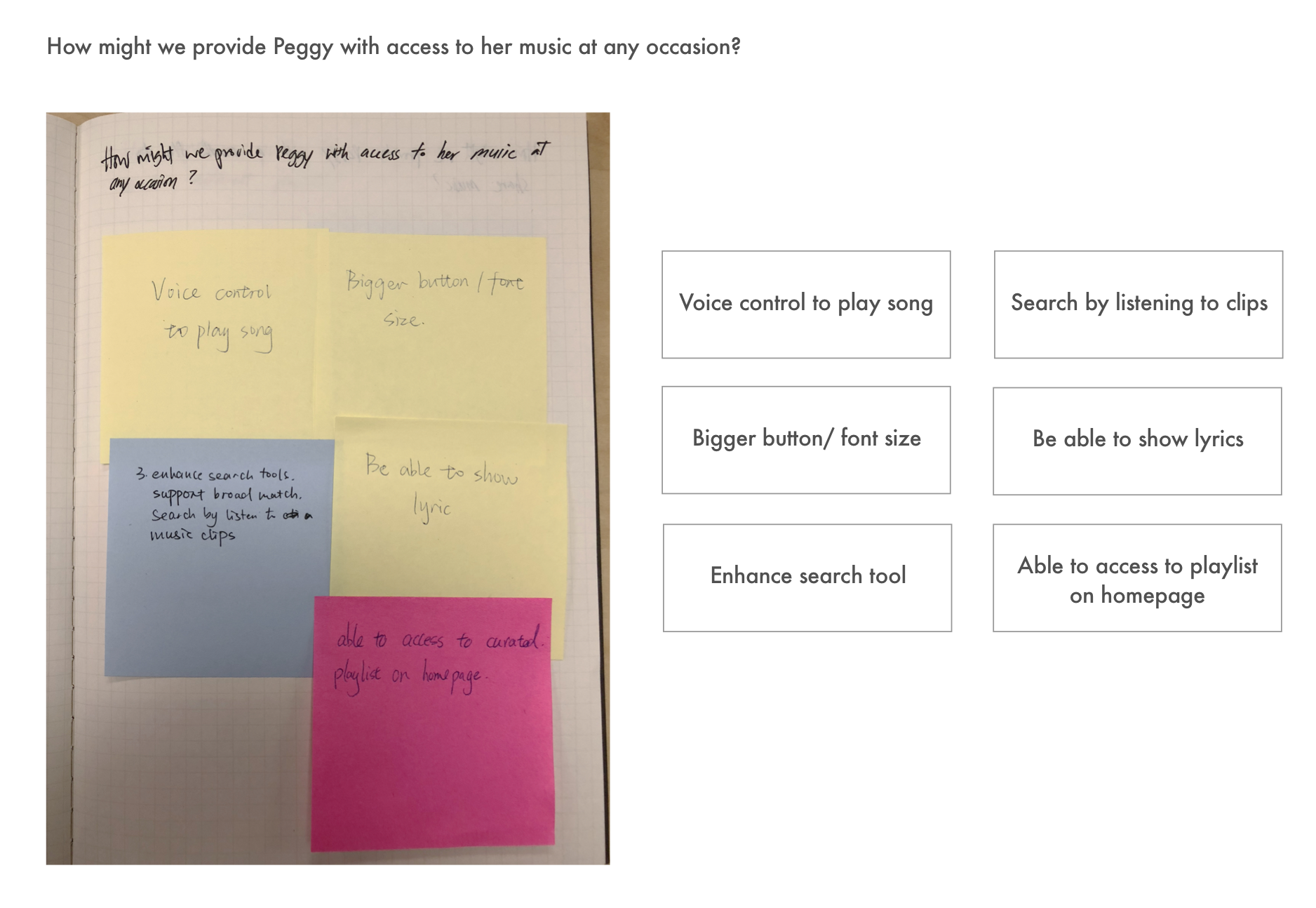
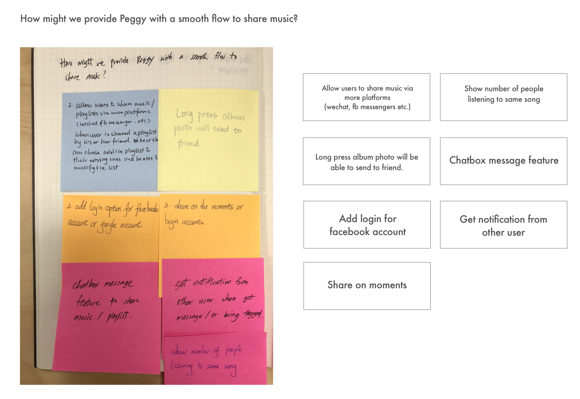
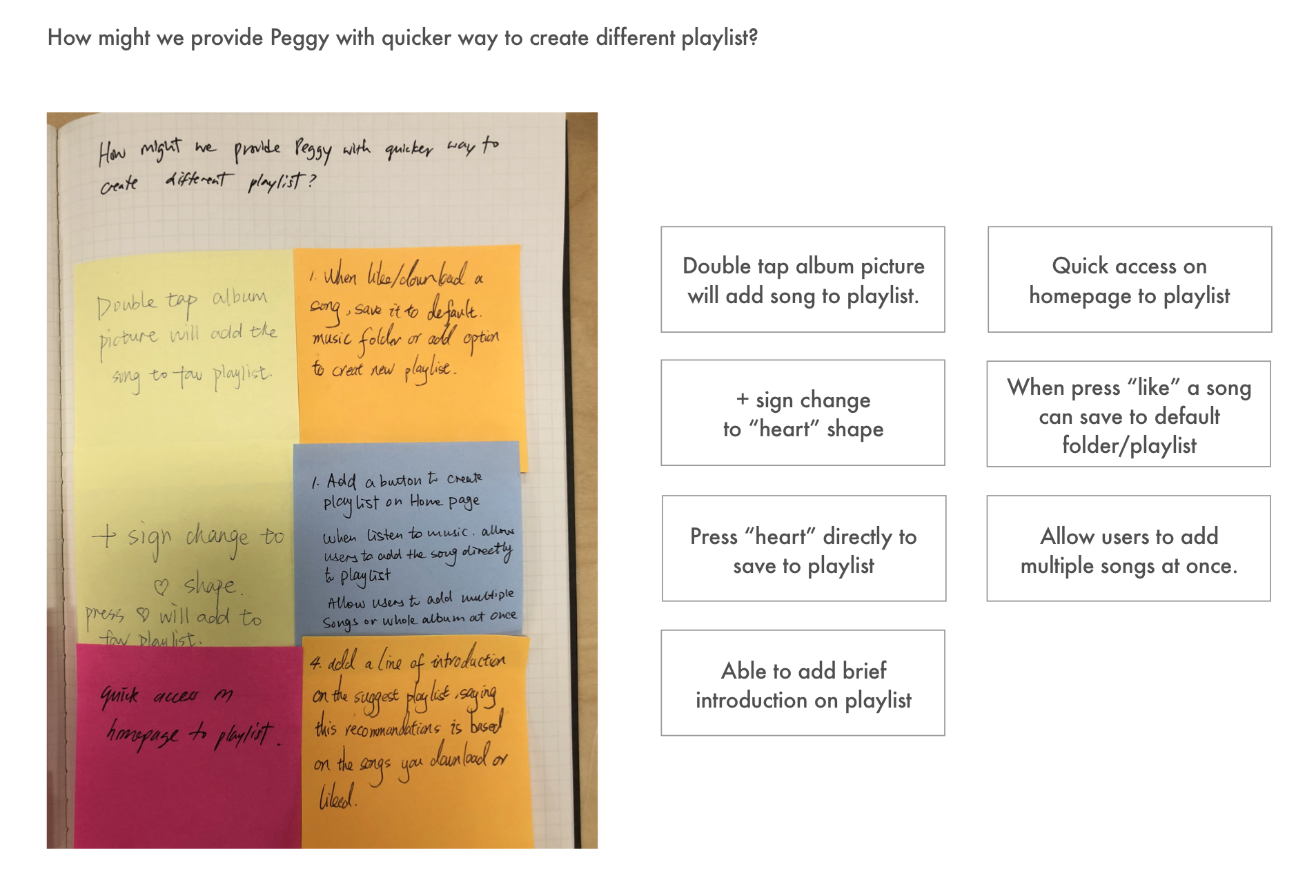
After creating personas, I began creating a POV Statements + HMW Questions documents. By looking back at the insights and needs, I came up with POV Statements and lead to “How Might We” questions. A set of HMW questions help me define and identify users’ need and prepared myself to move into ideation process.
I facilitated a small group of 4 participants to discuss about the three “HMW questions”. During this group brainstorming session, I watched closely how participants started to engage with each other and started to open up to share their ideas. The session took about 30 mins and I have jotted down their suggestions and turned them into notes for my future design ideation.
INFORMATION ARCHITECTURE
Methods Used: Project Goals + product roadmap+appmap
To define Spotify’s goals (business goals/user goals/ technical considerations). By doing so, I can focus on designing the site to actualize the shared goals.
Looking back at the ideas generated during brainstorming session, and now determined which goals would be in different priority then developed into a social feature. Then, I outlined details for each of the need and would respond to fulfill the needs of both parties.
By looking back at Spotify’s current app structure, I have created this app map and revised with additional new feature for Spotify. In the revised map, I would show how the new social features integrate into existing structure and flow. Green squares indicated the newly added features.
INTERACTION DESIGN & VISUAL DESIGN
Methods Used: User flow + Task flow + Sketching/Wireframes
User flow is to think through a user path to take through different scenarios and tasks. By mapping user’s journey and possible decisions, I can design the key pages and necessary steps to follow in order to complete the task with zero error.
Wireframes Sketches : Before designing my high-fidelity wireframe, I have sketched the key pages to add new social features and established the UI requirements.


You can see my UI requirement list here
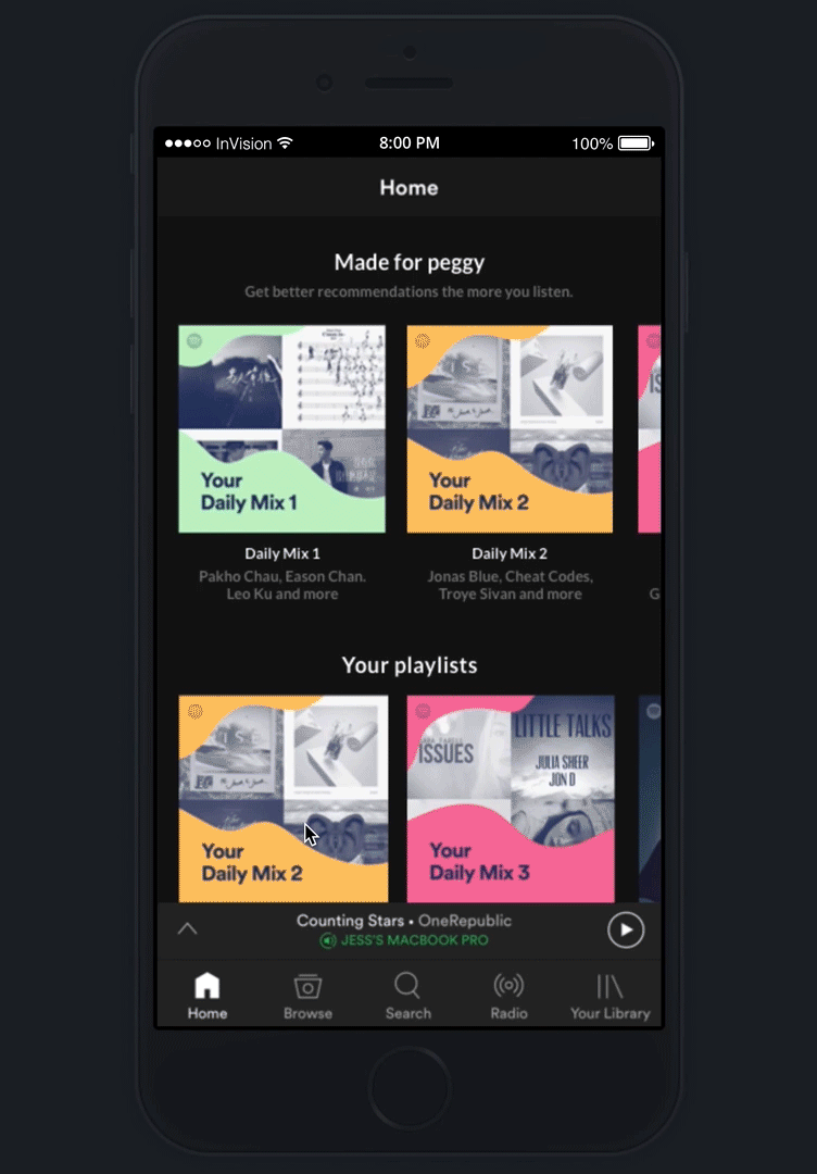
Next, I started to create key pages wireframe to showcase the necessary steps for user’s to complete certain tasks of sharing music. Based on my previous interview results and research findings help to provide me the mindset to design necessary steps for a smooth user flow.
Spotify App Wireframes : Created the key pages wireframes for Spotify’s mobile version.

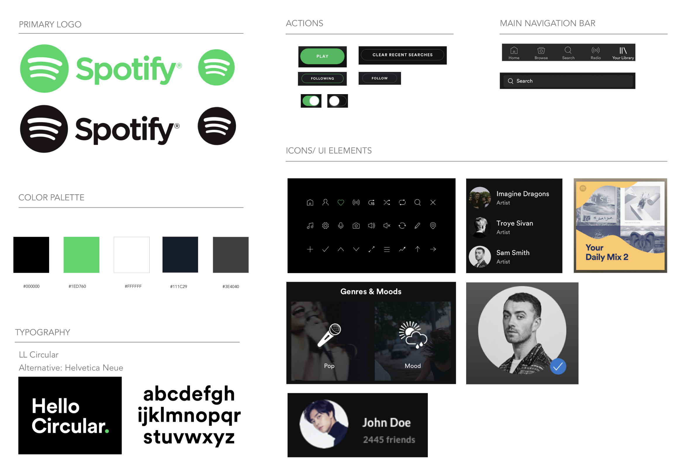
BRAND IDENTITY
Since Spotify has existing brand logos and already well established. So I created the mood board, style guide and UI kit mainly based on existing materials.
These are the main character that I think Spotify would want to emphasize to Spotify’s users are: BOLD/ VIBRANT/ IN TREND/ COURAGES/ PASSIONATE
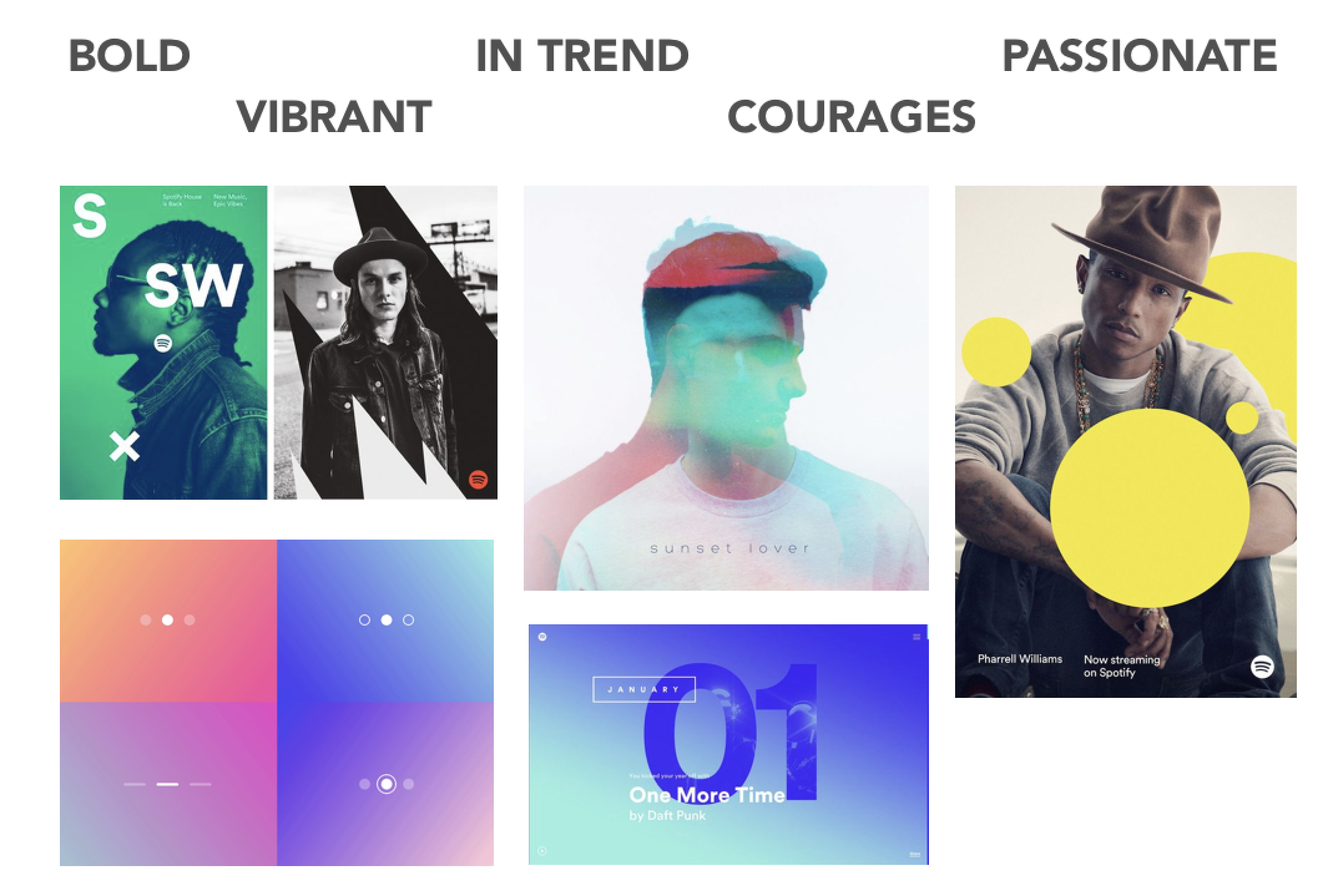
Style Guide is created from collecting Spotify’s existing color palette, typography, logo and icon set.

I also collected all UI elements into a UI kit including logo, color palette, typography, actions buttons, icons and navigation bar. This UI kit helps make sure all elements are consistent throughout the app.
PROTOTYPING & TESTING
Methods Used: Usability testing
High-fidelity wireframes : Based upon feedback gathered from the first mid-fidelity prototype, I created an updated, high-fidelity prototype and tested again with participants.
I created a limited function prototype in Sketch and merge into InVision for users to test out my prototype.
CLICK HERE TO TRY MY PROTOTYPE

Usability testing : This result is based on five participants with two male and three female age ranged from 26-35 years old. Two tests are done remotely by sharing the InVision prototype link and three are done in person while I watched closely on how they complete the tasks.
Tasks to be completed:
Complete transactions with using search bar and navigate to type in promotional code.
Locate wishlist and shopping bag then eventually complete transaction.
You can see my usability Finding notes here.
Affinity Map: Created this tool to list out the strengths, pains, suggestions and UI design recommendations that I retrieved from the usability testing. I have put these insights and observations in order from highest to lowest priority. This gives me a broad and detailed idea of what I should be focusing on while iteration phase.


PROJECT TAKEAWAYS
While working on this project, I realized that adding a new feature into an existing app with well established design elements has quite a few constraints. Since users are already using the app the way they used to interact, when adding new features, designers should be also adding an introduction guide. I also gave much thought that why Spotify had decided to end their in app social messaging feature. I am in a certain of doubt upon Spotify’s statement on the reason of cutting the in app message feature since lots of the participants in my interview and testing suggested that they enjoy using in app message feature to increase their social interaction.
NEXT STEP
If time allows, I would improve Spotify’s social interaction features:
1. Add short clips or step by step guide while launching a new feature to increase users awareness.
2. Add feature like “double tap the album or song to help user share song or add song to playlist easier.